Frames - Your Artwork’s LBD
You may hang art simply because it's "the thing to do," without giving much thought to the frame. And why would you…there’s supper to make, workouts to squeeze in, and a plethora of other things taking up your precious time and energy. But as a bonafide Design Nerd, this is the kind of thing that gets me fired up!
Framing has a long, fascinating history. The oldest known frame was found in an Egyptian tomb and dates back to AD 50. Originally, frames existed to separate artwork from reality. They focused the viewer’s gaze, creating a visual boundary that reduced distraction from the surrounding space. And who doesn’t need a little help getting away from the chaos and noise of today’s instant gratification frenzy?
But I digress…

Early frames were drawn or painted around the edges of the image. Eventually, they evolved into carved, three-dimensional casings that also helped protect and transport the artwork. Over time, regional differences developed—Italian frames were typically made from Poplar or Walnut, Dutch from Bass or Linden. Art historians still use these details to trace the origin of old works.

Now let's leave the museum behind and talk about what framing should mean in your home. While it still functions to draw attention to a piece, framing today is also about personal expression. It's part of how we make a piece our own. But with so many prefab and custom options out there, how do you choose something that complements both the artwork and your style?
As Rita Konig put it in Elle Decor's March 2025 issue: "The relationship between art and interiors is a dance... the art and the interior need to complement one another, not fight or match." This tricky dance is why many people fall back on the equivalent of the Little Black Dress (LBD) for their art—the simple black or wood-tone frame with flat, two-inch borders. Just like the OG Black Sheath Dress, it works just fine. But it could be SO. MUCH. BETTER.
Here are four key things to consider when choosing a frame that will elevate your art from "just fine" to unforgettable:
1. PROPORTION
Whether you're framing a solo piece or creating a gallery wall, the overall size—including the frame—should feel balanced on the wall. The art should hold enough visual space to avoid looking lost, but not so much that it overwhelms the space.
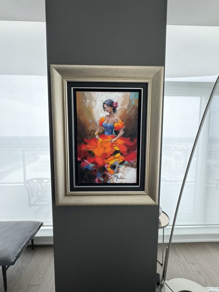
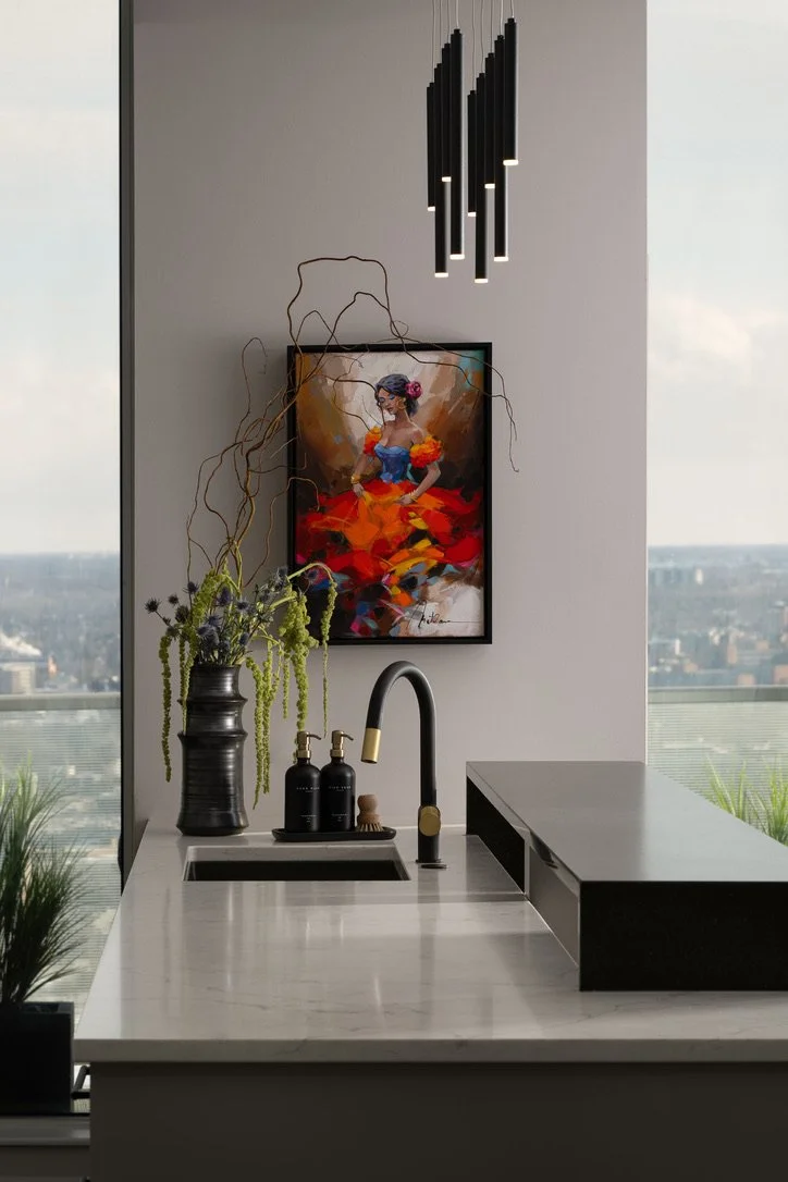
For example, in one project, the original frame nearly covered the wall. It was neutral in color but felt heavy, dimming the vibrancy of the artwork. We swapped it out for a sleek black frame and mounted it on a wider, light grey wall. The result? The piece finally had room to shine.
2. HARMONY
This is where the artwork and your interior design need to play nice together. Since most of us collect art over time, our homes end up with a mix of eras, styles, and mediums. The frame becomes the bridge tying it all together.


Take this grouping of paintings, originally framed in a way that suited a traditional and classic interior. When moved to a modern condo, they felt out of place. We reframed them with wider black frames featuring a textured, pebbled shagreen surface—toughening up their softness. Mottled bronze fillets (those narrow, decorative strips just inside the main frame) helped ease the eye from the painting to the new edge, while also complementing the iron Wall Climbers, which were brought in to reflect the clients’ love of physical fitness.
3. COLOR
A lot of experimenting (and a touch of psychology) is required when choosing colors in design and framing is no exception. Of course the colors in the artwork are great guidelines, but more crucial is the decision to offset or highlight those colors. Then, there are the colors found in the space where the artwork will hang…and whether we want to offset or highlight those colors. If this makes you think you’d prefer to visit your favorite dentist for that root canal you’ve been putting off, don’t worry…just reach out and we can help you with this!
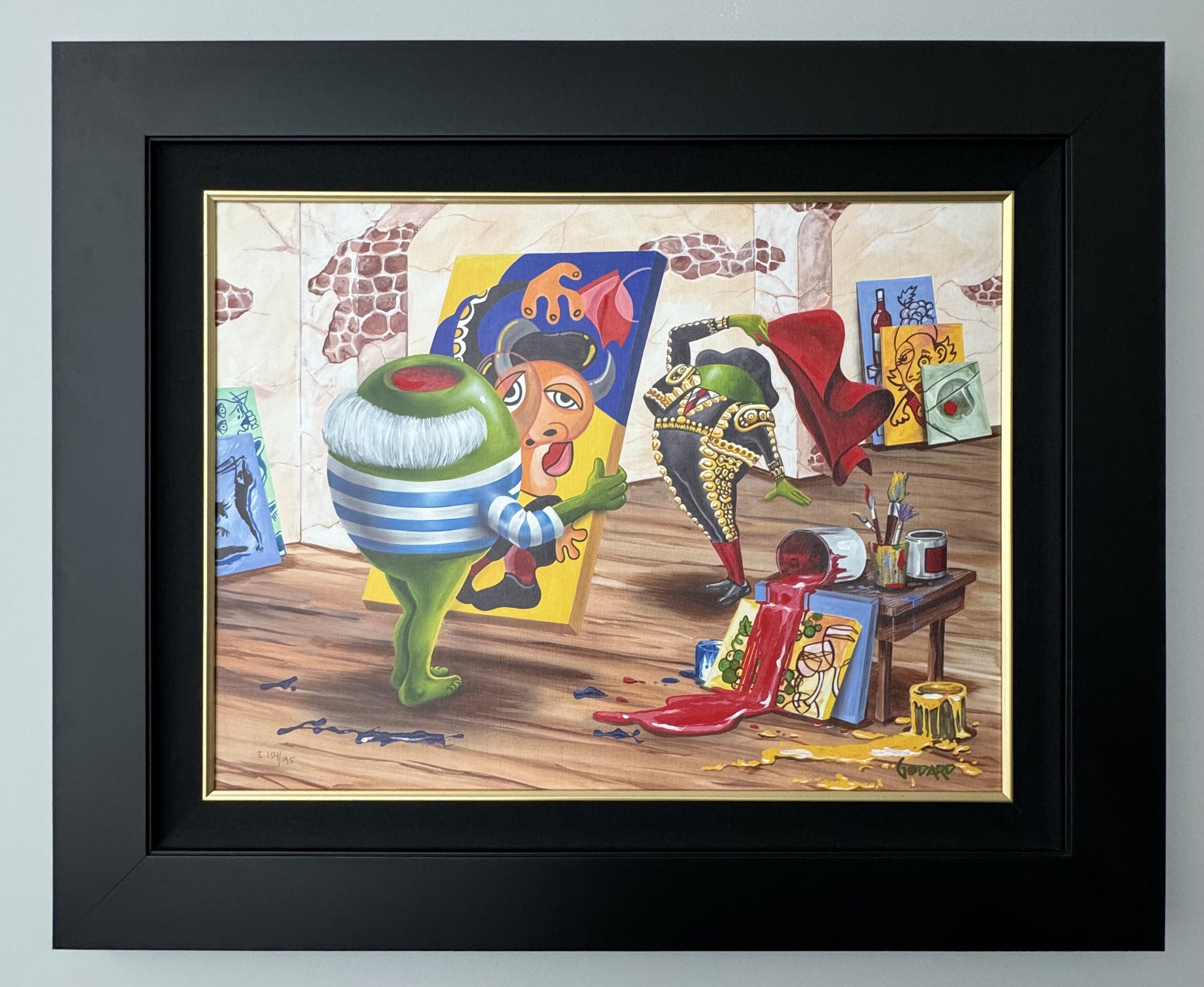
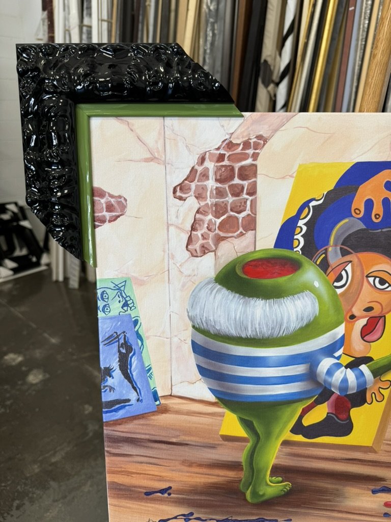

This cheeky painting from Michael Godard is no wallflower! It was originally framed with a plain frame meant to keep focus on the artwork. Instead, it dulled its personality. We chose a black lacquer frame with Baroque details that stood its ground next to the bold image. A bright green fillet mirrored the olive tones in the piece, while a nearby Foscarini Orbital Floor Lamp tied the whole look together.
4. PURPOSE
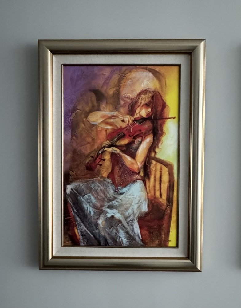
Picasso once said that art washes the dust of daily life off our souls. Indeed, artwork has the power to elicit a wide range of emotions, from joy to nostalgia. There’s no right or wrong way to react to artwork, but it is important to identify what each piece of artwork evokes in you and choose a frame that amplifies that sentiment.

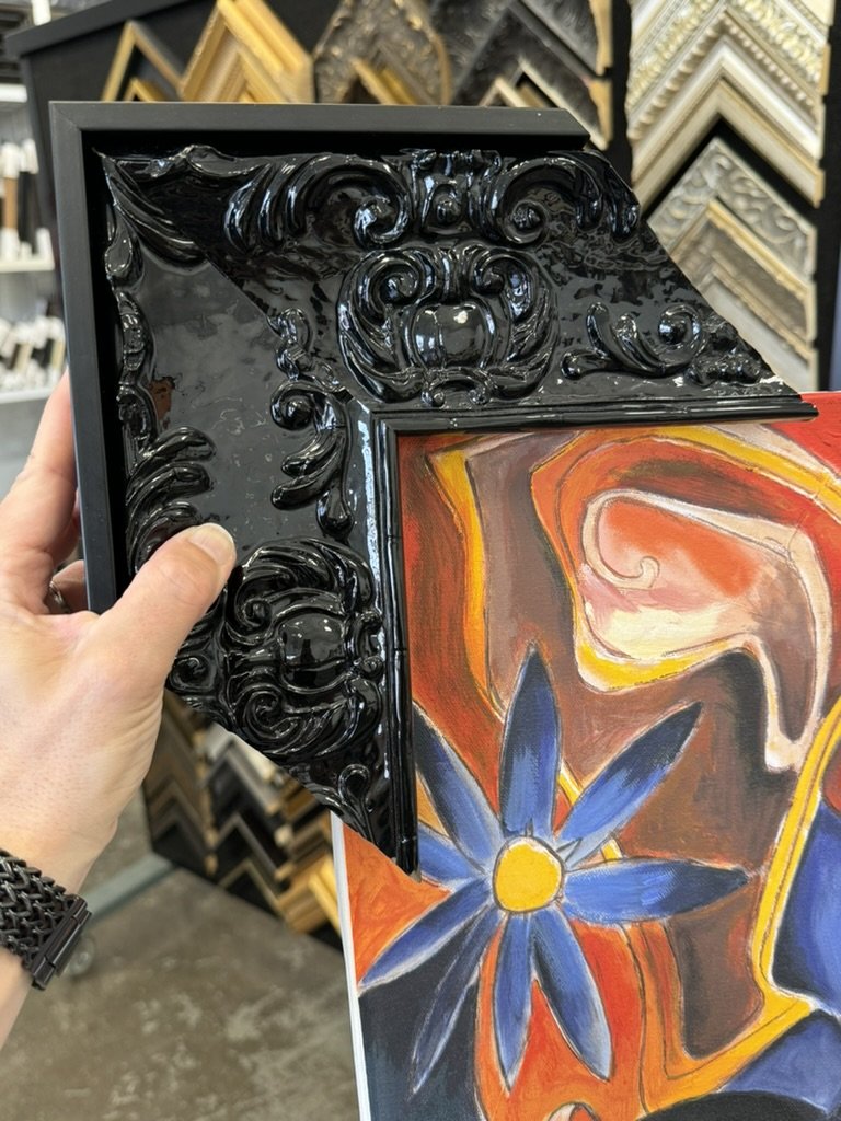

One client’s beloved Alexandra Nechita painting was originally in a frame that faded into the background—literally. Its red tones washed out the artwork’s vivid palette. We gave it the spotlight it deserved with a black lacquered, Baroque-style frame. Looser curves in the design echoed the artwork’s energy, while a slim black floater frame neatly contained the colorful chaos.
If all this feels overwhelming, don’t worry. Working with a designer, along with framing experts like the talented team at Wallspace Gallery & Framing (wallspacegallery.ca) or art advisors like the exceptional Mason Lane (masonlaneart.com), can guide you through the process.
Remember, framing isn’t just an accessory—it’s an investment in the art you already love. As Mason Lane founder Katharine Earnhardt says, "Frames go in and out of style, so changing them every few years will help keep your art feeling fresh and exciting."
So, are you ready to give your artwork the frame it truly deserves? Let’s ditch the default and find its perfect match.
About the Author


Founder of TouchStone Interiors
After a successful and rewarding career in military healthcare, Nathalie followed her lifelong passion for design into the next chapter of her life. Beyond her formal education in decor and design, Nathalie continuously seeks out new and exciting materials and finishes to best serve her clients. An active member of the design community, she volunteers with the Decorators and Designers Association of Canada (DDA) and is a member of the National Kitchen & Bath Association (NKBA). Her experience in healthcare and corporate management enables her to simultaneously design a space that caters to her client's physical and mental wellness while delivering a seamless project management solution.